Monetization KPIs
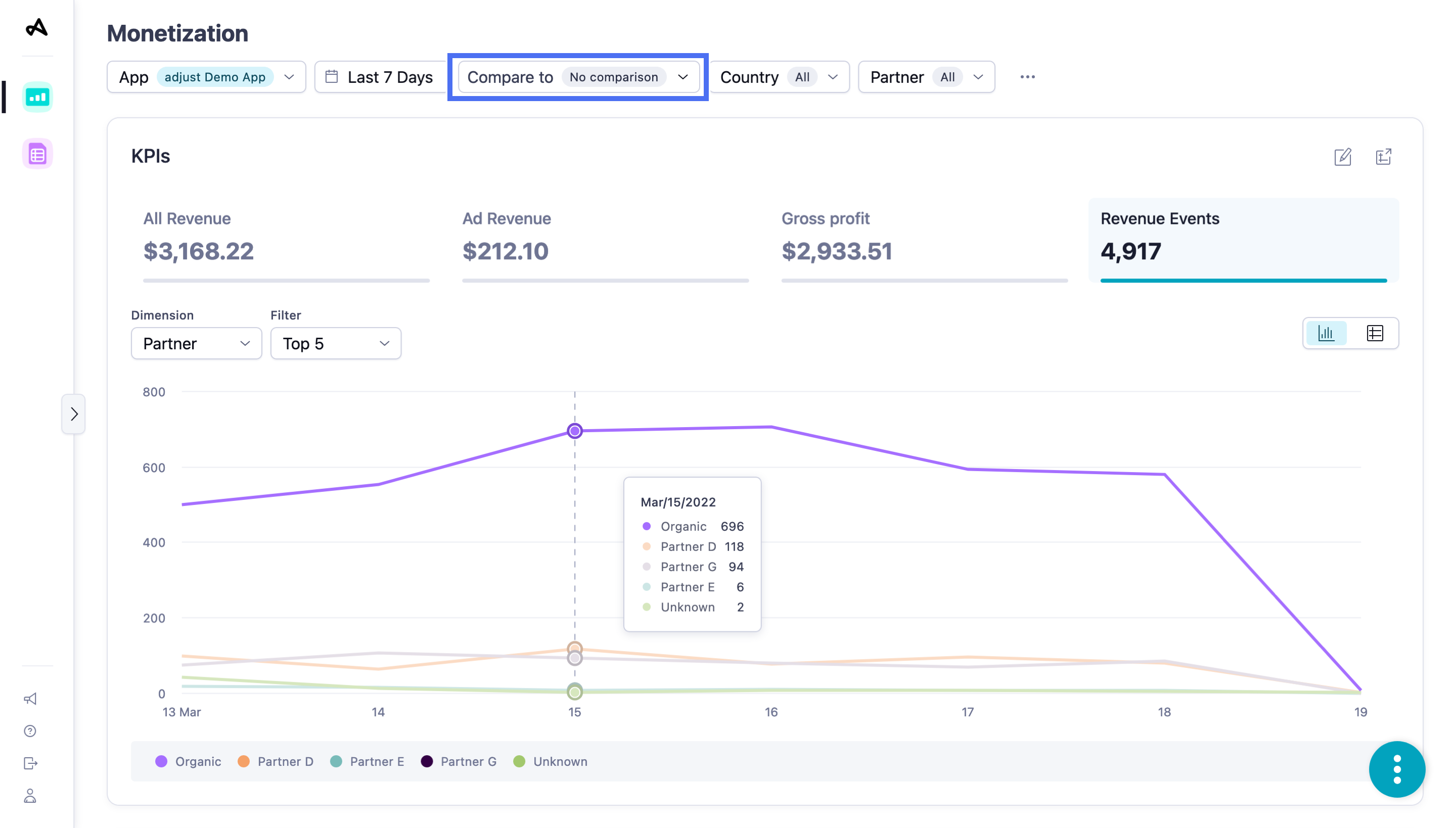
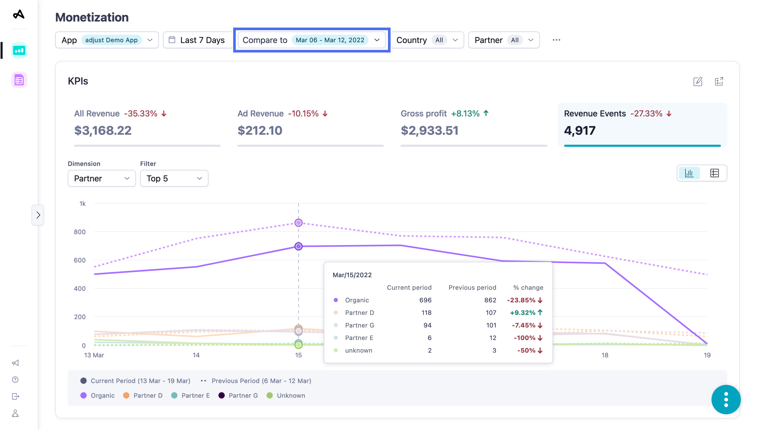
The KPIs widget is a snapshot of the four main KPIs that you typically use to monitor the revenue performance of your campaigns. The widget also displays historical graphs to help you spot trends that might prompt you to make changes to your campaigns.
Your widget displays data from the following sources, by default:
| Data source | Definition |
|---|---|
| Attribution source - First | User's original attribution source |
| Attribution status - All | Installs and reattributions |
| Attribution type - All | Clicks and impressions |
| Ad spend source - Mixed | Attribution and Network sources |
Set up the KPIs widget
Before you set up this widget, ensure that you have set the appropriate filters. For more information, see Set up your view.
The KPIs widget shows a chart tracking how the selected KPI has changed in the selected period. By default, the widget displays data for the following KPIs:
- All Revenue
- Ad Revenue
- Gross Profit
- Revenue Events
By default, you can see the daily trend for the selected KPI and time period by Total value. You can also choose to display daily trends for the KPI by the following dimensions:
| Dimension | View by |
|---|---|
| App |
|
| Country | |
| Channel | |
| Total value | - |
Depending on the time period for which you are viewing data, you can select Hours, Days, Weeks, or Months to choose the data granularity.
Select  (Table view) to view data for all 4 KPIs in table format. Select
  (Chart view) to switch back to the graph view.
Select  (Open as report) to view the data in the form of a new report.
Choose your KPIs
Customize the widget to display the KPIs that you are interested in. To customize the widget, follow these steps:
- Select
 (Edit KPIs). You can now see the four KPIs currently selected for visualization.
 - In the four drop-down menus you can see which KPIs are available. Select a new KPI from the list to add it to your view.
- Currently selected KPIs are greyed out.
- Select Apply.
Great job, the widget is updated with your new KPI selection.
For detailed information about the metrics, use our Datascape metrics Glossary.
Use the KPIs widget
Switch between the four KPIs in the widget to view data relevant to that KPI.
Hover over any data line in a chart to see more information about the data.
Hover over any title in the chart legend to highlight the data line in the chart that corresponds to that title.
Select the title in the chart legend to hide the data line for that title in the chart. Select the title again to reveal the data line.

 (Edit KPIs). You can now see the four KPIs currently selected for visualization.
