Activity distribution
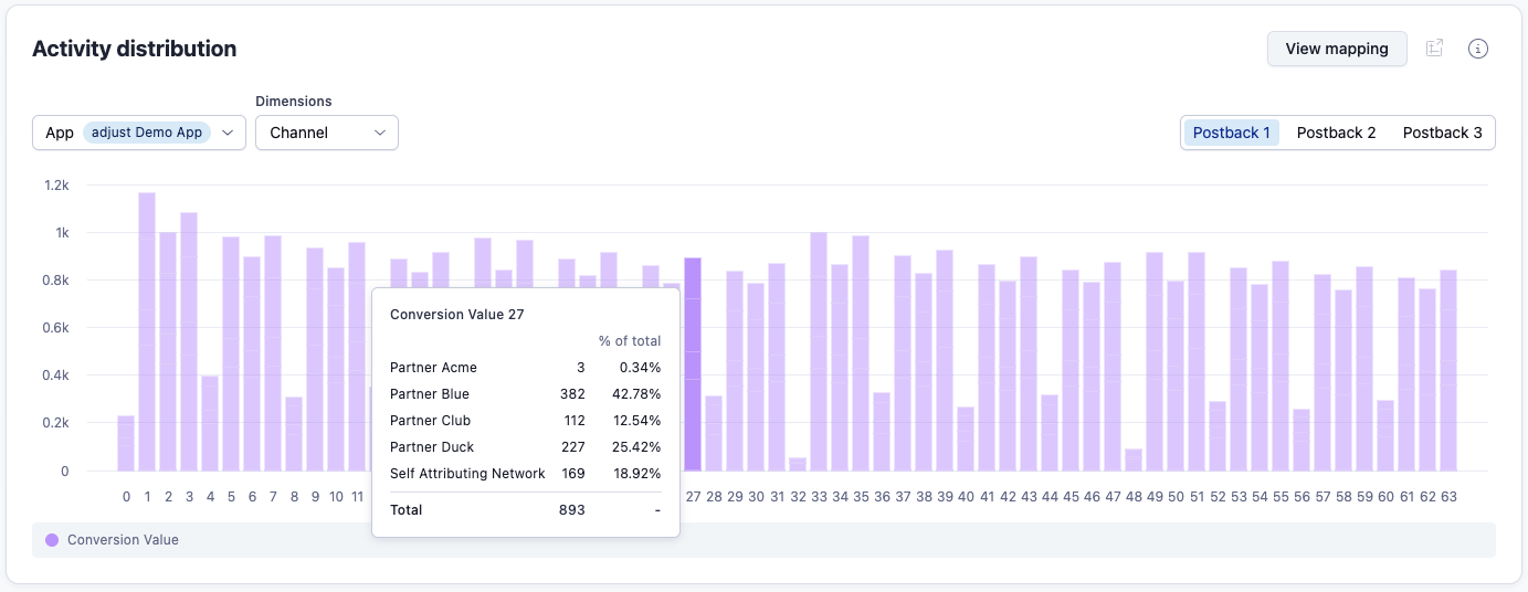
The activity distribution widget is a histogram that shows you the overall distribution of conversion values per rolling period with filters available for partner and campaign name. This lets you see how well you have set up your conversion value mappings, and how well a particular partner is performing.
Use the activity distribution histogram
- Y axis: Postbacks
- This shows how often a conversion value was tracked.
- X axis: Conversion Value
- This shows the conversion value number (0-63).
You can only view the activity distribution for one app at a time. Use the selector to pick the app you want to use.
Selecting the SKAN postback
The Activity distribution widget can show you data from all versions of SKAN you're running campaigns on. If you have SKAN 4 selected, you'll see the option to switch between views for the first, second, and third postbacks.
The first postback view includes the single SKAN 3 postback plus the 1st SKAN4 postback. It only includes fine conversion values.
The second and third postbacks are only applicable for SKAN 4 campaigns. Additionally they will only shows coarse conversion value distribution: null, low, medium, high. To recap on what this means, read our guide to how SKAN 4 works.
Selecting a time frame
By default the graph uses data from last 7 days but can be changed to a custom period using the SKAN dashboard global filters. If you don't have data available for the selected period, you see a “No data” state display.
You should wait a minimum of 5 days for data to display in the histogram. This is because SKAN 3 enforces a 24 hour conversion value window, plus a maximum of 24 hours for the postback timer. Additionally, as with all SKAdNetwork reporting, Adjust requires 3 days to retroactively pull data from integrations with Meta, Google and Twitter.
If you change your CV mapping, the data in the graph will be a mix of results from the old mapping and new mapping. Because of this, you should always wait the full period after changing a mapping to evaluate the results.
Check your mapping performance
Using the histogram, you can get an immediate picture of whether your conversion value mapping is set up in an effective way for your app. This is important, as having the mapping set up to accurately reflect how users behave in your app is key to getting the best insights from your SKAN campaign data.
When you are set up using the 63 CV mode, the distribution is shown across 1-63 values.
What to look for:
-
A smooth curve with peaked distribution in the middle.
-
A complete tapering of results to null at both the start and end of the range.
-
If the distribution curve is strongly trending for only lower conversion values, it means that the conditions you've set, such as the revenue ranges, are likely not being triggered within the CV window.
-
If no peak is shown across the distribution, you probably haven't set triggers that reflect your actual users' behavior.
Check your partner performance
The widget allows you to add a dimension to the graph, filtering what's shown in the histogram to just data from that dimension.
Available dimensions:
- Channel
- Campaign Name
By using a dimension, you get the added value of seeing the activity distribution breakdown for a single channel or campaign. This lets you better evaluate your partners' performance.
Tooltip analysis
You can use the tooltip to show a channel breakdown. This means that when several channels are contributing to the data, you can see how each is performing against one another by hovering over a specific conversion value.

